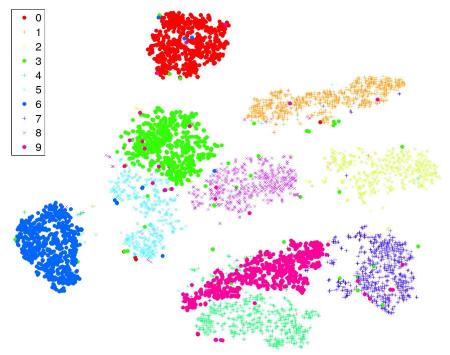
What you see below is a 2D representation of the MNIST dataset, containing handwritten digits between 0 and 9. It was produced by t-SNE, a fully unsupervised algorithm.
The labels were unknown to it, yet the result almost perfectly separates the classes.

In this post, we are going to dive deep into how this magic is done!
Hidden manifolds in the data
Data in real-life applications can have thousands of dimensions. However, very often, the points lie around a lower-dimensional manifold. In practice, this means that not all features are necessary to represent the data faithfully: by cleverly combining some features, others can be closely approximated.
Take a look at the toy example below.

Although two features describe the data, some nonlinear combination (representing the manifold) could be sufficient for many purposes.
The problem is, finding this is extremely difficult. There are two main issues. One issue is nonlinearity; the other is the inexact nature of this problem.
Putting this into mathematical form, suppose that we have a dataset
and our goal is to find a lower-dimensional representation
where is the number of raw features and is the number of features after dimensionality reduction. is much smaller than .
Popular methods like PCA only work if new features are linear combinations of the old ones. How can this be done for more complex problems?
t-SNE is one method that can deliver outstanding results. Let's see how it works!
Unwrapping t-SNE
To provide a faithful lower-dimensional representation, we have one main goal in mind: close points should remain tight, distant points shall stay far.
t-SNE achieves this by modeling the dataset with a dimension-agnostic probability distribution, finding a lower-dimensional approximation with a closely matching distribution. It was introduced by Laurens van der Maaten and Geoffrey Hinton in their paper Visualizing High-Dimensional Data Using t-SNE.
Since we also want to capture a possible underlying cluster structure, we define a probability distribution on the -s that reflect this. For each data point , we model the probability of belonging to the same class ("being neighbors") with a Gaussian distribution:
The variance is a parameter that is essentially given as an input. We don't set this directly. Instead, we specify the expected number of neighbors, called perplexity.
To make the optimization easier, these probabilities are symmetrized. With these symmetric probabilities, we form the distribution that represents our high-dimensional data:
Similarly, we define the distribution for the -s, our (soon to be identified) lower-dimensional representation by
Here, we model the "neighborhood-relation" with the Student t-distribution. This is where the t in t-SNE comes from.
Our goal is to find the -s through optimization such that and are as close together as possible. (In a distributional sense.) This closeness is expressed with the Kullback-Leibler divergence, defined by
We have successfully formulated the dimensionality reduction problem as optimization!
From here, we calculate the gradient of KL divergence with respect to the -s and find an optimum with gradient descent. Fortunately, we can calculate the gradient simply:
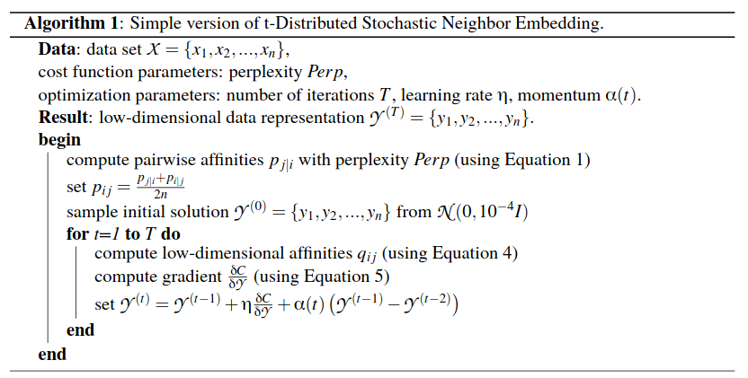
This is the full algorithm, as summarized by the authors below.

Exploring MNIST with t-SNE
When you feed the MNIST handwritten digits dataset to t-SNE, you can make out the clusters from the result. You have already seen this at the beginning of the post. Now you understand how the algorithm made it.
This is one of the most powerful illustrations in machine learning.

When compared to other datasets, t-SNE often has "superior" performance. (I put superior in quotes because there is no simple quantitative measure of performance.)
The authors provide the following visual comparison on MNIST.

If you want to see more MNIST with t-SNE, here is an interactive 3D visualization that you can rotate around as you wish!
Caveats of t-SNE
t-SNE has a lot of small details that should be taken into account when using it for visualization.
First, unlike PCE, t-SNE doesn't give an explicit transformation that you can reuse. So, if you have obtained some new data, the entire optimization has to start from the beginning.
This is a problem because t-SNE can be really slow. For n data points, two n x n matrices are constructed and used. The gradient also involves a summation, which puts even more computational load. Fortunately, this issue can be circumvented by clever implementations utilizing GPU or the Fourier transform.
Another issue with t-SNE is that it is not deterministic. Running the algorithm two times will yield two different results. Because of this, reading a t-SNE plot can be like reading tea leaves.
Summary
In many applications, datasets can have thousands of features. To obtain an early insight into the structure of the data, data scientists can use various dimensionality reduction methods.
Simple methods like PCA often fail due to the nonlinear nature of the structure. Computer scientists developed several methods to solve this issue. In their paper Visualizing High-Dimensional Data Using t-SNE, Laurens van der Maaten and Geoffrey Hinton introduced t-SNE, which has become a landmark result since then.
t-SNE cleverly describes the point clouds with dimension-agnostic matrices obtained from statistical models, then identifies lower-dimensional representations by making the probabilistic representations as close to each other as possible.
Since its inception, it has become one of the most popular tools, helping data scientists make sense of raw data.
 Tivadar Danka
